Grocero

A collaborative grocery management app for shared households

Story

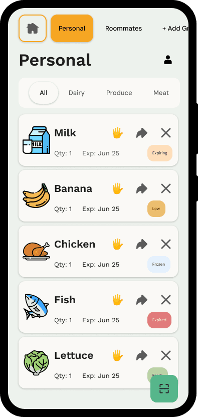
Grocero helps people in shared homes track groceries from purchase to use, reduce food waste, and avoid buying the same items twice.

In shared homes, food waste often starts with small coordination failures. Someone forgets what is already in the fridge. Someone else buys the same thing again. Perishable food gets pushed to the back, then quietly expires.

I designed Grocero to make grocery coordination easier without turning food tracking into another chore. The goal was not to make people manage more. The goal was to help them think less, forget less, and waste less.

Role

UX Research

UX Design

Prototyping

Usability Testing

Team

Solo Project

Timeline

January 2025 - May 2025

Methods

Competitive analysis

Generative interviews

Personas

Storyboarding

User flows

Paper prototyping

Moderated usability testing

Impact

3

generative interviews

3

rounds of in-person paper testing

3

rounds of remote moderated prototype testing

60%

90%

task completion improvement

20%

80%

urgent-item recognition improvement

Problem Statement

The Problem

Shared living situations often lead to food waste because groceries are managed collectively but remembered individually. People forget leftovers, lose track of expiration dates, or buy duplicates because there is no simple shared system that fits naturally into everyday life.

Why this Matters

43%

of total food waste in the U.S. happens at the household level.

A large share of that food is still edible. It is often wasted because of poor communication, improper storage, forgotten items, misjudged portions, or confusion around freshness and expiration.

The Challenge

How might we help people manage groceries efficiently without making them feel burdened?

How might we reduce food waste without requiring constant monitoring and co-ordination?

The Opportunity

Most existing tools solve only part of the problem. Some support meal planning. Some support inventory. Some support scanning. But very few help shared households answer the everyday questions that actually matter:

What do we already have?

What is about to go bad?

Who is buying what?

What needs attention right now?

Context, Users and Design Principles

At the start, I was thinking about the problem partly through the lens of better tracking. I assumed that if I made tracking feel smarter and more efficient, people would naturally want to use the product

But as the project developed, that framing became less useful on its own. The bigger issue was not just helping people track groceries better, but reducing how much effort, memory, and coordination shared grocery management required in the first place.

Who I Designed For

Time-constrained people who want a faster way to manage groceries

Cost-conscious users trying to avoid wasting money on forgotten food

Environmentally aware users who see food waste as both a practical and ethical issue

Tech-comfortable users open to mobile tools, scanning, and lightweight automation

What these users value

(Based on User research & Testing)

A balance between automation and control

Clear visibility into what they already have

A system that helps without becoming demanding

Less duplicate buying

Less waste

Less mental overhead

A limitation in the framing

This project focuses on what individuals and households can do, not on the larger systemic causes of food waste. That is an important limitation. I was not trying to solve the full food system. I was trying to design for the everyday coordination problems that happen inside shared homes.

Competitive Analysis

To understand where Grocero could create value, I studied four existing products.

What I was looking for

I wanted to understand:

1

How existing tools handle inventory tracking

2

How they reduce manual effort

3

How they communicate urgency

4

Whether they actually support shared-household coordination.

What I found

Mealime

is strong at meal planning and grocery list generation, but it does not meaningfully support post-purchase tracking or food expiry.

NoWaste

directly supports expiry tracking, but it depends heavily on manual entry, which creates friction over time.

Pantry
Check

offers stronger visibility into inventory and kitchen management, but the experience feels dated and limited.

Yuka

uses barcode scanning well, but it is focused on product quality and nutrition rather than household coordination or food waste prevention.

Key takeaway

The gap was clear:

Planning tools help people buy food.

Inventory tools help people log food.

But shared households still lack a low-friction way to coordinate around food already at home.

This became an important turning point in the project.

Early on, it was easy for me to imagine a broader product that combined planning, tracking, recipes, donation, and more. But looking across existing products made it clear that breadth was not where the opportunity was. The stronger direction was to focus on shared-household coordination and do that well.

This insight shaped Grocero’s direction:

Make input easier

Make shared ownership clearer,

Surface what matters before food is wasted.

Make input easier

Make shared ownership clearer,

Surface what matters before food is wasted.

Generative User Research & Insights

To better understand the problem beyond my own assumptions, I spoke with real users about their grocery habits, frustrations, and routines.

Methods

  1. a semi-structured interview script with open-ended questions,

  2. prompts to probe for stories and examples and

  3. observational prompts to capture how grocery behavior plays out in real settings.

I intentionally focused on lived routines rather than asking users to react to solutions too early. I wanted to understand not just what people said they wanted, but where grocery coordination actually breaks down.

What I learned

1

Food waste was rarely the “main problem”

2

Manual tracking creates dropout

3

Shared systems break when labels are unclear

4

People want support, not surveillance

1

Food waste was rarely the “main problem”

Most people did not describe their issue as “I waste food.”

Their usual descriptions were:

I forgot we already had it.

I did not know someone bought it.

I meant to use it.

I could not tell what still needed attention.

That was an important shift. The real design problem was not simply waste. It was coordination, memory, and visibility.

2

Manual tracking creates dropout

Users were open to the idea of better grocery tracking, but not if it meant constantly entering or updating information themselves.

This pushed me toward:

receipt scanning

barcode scanning

simplified manual entry

(as fallback)

lightweight check-ins

rather than heavy maintenance.

3

Shared systems break when labels are unclear

Even before prototyping, I saw that household language matters. People interpret categories, roles, and ownership differently.

That later became one of the biggest usability problems in testing.

4

People want support, not surveillance

Users wanted reminders and visibility, but not a system that felt rigid or demanding. That became a guiding principle for the final design.

Grocero should not ask users to become inventory managers.

It should support the moments where memory and coordination usually fail.

Persona Development

Using interview transcripts, quotes, and patterns from Generative User Research , I created personas to represent recurring behaviors, frustrations, and needs.

The personas helped me move from general observations to specific design tradeoffs.

I was not designing for one ideal user. I was designing for people with different living situations, levels of effort tolerance, and mental models around grocery management.

This pushed the design toward:

Lower-effort input

Clearer group and ownership language

Simple visual hierarchy

Multiple ways to add food depending on the user’s style

User Scenarios and Storyboarding

Designing for real-life moments

I created scenarios and storyboards based on the personas to understand how Grocero would fit into real-world contexts.

Storyboard - 1

Storyboard - 2

What storyboarding clarified

Where the interaction happens

What the user is trying to do in that moment

What level of effort they are realistically willing to give

How the system should respond without slowing them down

User Flows

I began by brainstorming all of the possible actions users might take in Grocero, then narrowed them down to the core processes that mattered most.

Adding Groceries

Claim an Item to Buy

Flow mapping helped me think through edge cases, graceful failure states, and how the system should respond when users make mistakes, change their minds, or move through the experience differently than expected.

Usability Testing

PAPER PROTOTYPING

Before moving into polished screens, I tested the concept with a paper prototype to see whether the core interactions made sense at all.

I designed five task-based interactions using paper, pens, and sticky notes. Each task involved multiple actions such as tapping, scrolling, selecting, or entering information.

A young professional living with roommates

A parent managing a household

And a solo user who lives alone

User Feedback

Is ‘Person’ just for me or everyone?

I didn’t mean to assign it to them. Can I undo that?

I thought Groups meant produce, dairy, etc.

Why do I have to assign this every single time?

This feels more like tagging than grouping.

I didn’t even notice that was a button.

Problem 01

Problem 02

Problem 03

Problem 04

I didn’t mean to assign it to them. Can I undo that?

Is ‘Person’ just for me or everyone?

I thought Groups meant produce, dairy, etc.

“Groups” was unclear

Several users misunderstood “Groups” label.

Some thought it referred to food categories.
Others interpreted it as a tagging system.

Ownership language was too ambiguous

A participant was confused about whether “Person” meant the current user or a broader household grouping. That led to accidental assignment errors.

The “Raise Hand” / claim interaction had weak visibility

The claiming feature was useful in concept, but users struggled to find it or understand its function quickly.

The interface had too much visual noise

The solo user, in particular, wanted less clutter and more obvious action points.

This feels more like tagging than grouping.

Why do I have to assign this every single time?

I didn’t even notice that was a button.

Iteration 01

Added a clearer Groups header and improved reassignment behavior

Iteration 02

Introduced a dropdown for reassignment and created a clearer recovery path after mistakes

Iteration 03

Added a default group such as Personal Items to reduce repetitive setup

Iteration 04

Improved contrast, spacing, and visual prominence for key buttons

Iteration 05

Swapped generic icons for clearer ones, including a camera-related visual cue where appropriate

Iteration 06

Simplified the homepage and reduced clutter

Iteration 07

Moved item quantity for better scanning and layout flow

My biggest mistake in this phase was assuming that a label would be understood the way I intended it.

It was a strong reminder that information architecture is not just structure, it is language.

If the words are off, the flow breaks even when everything else looks fine.

MID–HIGH FIDELITY PROTOTYPING

After the paper prototype, I translated the concept into a more polished interactive prototype and tested the core flows remotely.

Participants were asked to:

1

Add groceries using receipt scanning,

Add groceries using receipt scanning

2

Navigate between shared groups

3

Claim an item to buy

4

Identify what was expiring soon

At this stage, I was less focused on whether the concept was valuable and more focused on whether the interface was clear, scannable, and actionable.

Feedback

Problem 01

Problem 02

Problem 03

Problem 04

Problem 05

Group names were still not visible enough

Users wanted quicker recognition of context and location.

The claim action did not feel clearly tappable

The icon existed, but the affordance was weak.

Form labels were not doing enough work

Users could not always tell whether they were looking at a bought date, an expiry date, or something else.

Urgent items did not stand out enough

This was a major issue because urgency visibility is central to reducing waste.

The cards carried too much information

Even useful information can fail if it competes too hard for attention.

Change 01

Bolded and repositioned group names so users could orient faster

Change 02

Increased padding and improved tap affordance for the claim interaction

Change 03

Added clearer headers and form labels in the manual entry modal

Change 04

Created stronger visual hierarchy across action icons

Change 05

Added urgency indicators and color shifts for near-expiring items

Change 06

Added serving-size or quantity context where users needed it

Change 07

Reduced text density and emphasized the most important information first

Iteration results

These results showed that the design was becoming more usable, but not fully finished. The scanner flow became more intuitive faster than the claim flow, which told me the claim interaction still needed stronger clarity and affordance.

60%

90%

task completion improvement

20%

80%

urgent-item recognition improvement

3

/

3

Participants successfully used the scanner flow

2

/

3

Participants used the claim button successfully

A polished UI can still fail if the hierarchy is weak.

Users do not experience screens feature by feature. They experience them through attention. This round made it clear that visual priority was just as important as feature coverage.

Final Prototype

The final solution

Grocero is designed to reduce grocery friction in shared households by combining low-effort input, shared visibility, and timely coordination.

Instead of asking users to constantly maintain a detailed inventory system, the product supports the moments that matter most:


adding food quickly,

seeing what needs attention,

and coordinating who is responsible for what.

Click around this interactive prototype !!

Solution pillar 01

Easy grocery input

Solution pillar 02

Smarter organization

Solution pillar 03

Weekly freshness check-ins

Solution pillar 04

Expiry and quantity prioritization

Solution pillar 05

Shared inventory and accountability

Solution pillar 06

Clear navigation

Easy grocery input

Barcode Scanning

Receipt Scanning

Manual Logging

People should be able to add groceries in the way that feels easiest in the moment.

Supported input methods

1

Barcode scan for fast item capture

2

Receipt upload for batch entry after a shopping trip

3

Manual entry for edge cases and flexibility

Why this matters

One of the biggest risks in the concept was user dropout due to manual effort. Supporting multiple input methods reduces that burden and gives users flexibility instead of forcing one rigid behavior.

Smarter organization

Group View

Items Confirmation

New Category

Once items are added, the system helps users make sense of them.

Features

1

Automatic categorization such as Dairy, Produce, or Frozen

2

Custom categories when households need their own structure

3

Item cards that surface name, quantity, urgency, and actions

Why this matters

Users do not just need storage. They need legibility.

Weekly freshness check-ins

Check In

Perishable items are hard to track accurately using dates alone. A quick freshness check-in gives users a lightweight way to update an item’s condition over time.

Feature

a fast 1–5 freshness rating for perishables

Why this matters

This gives the system a better signal for alerts while keeping the interaction simple.

Expiry and quantity prioritization

Item Info

Home Page

Group View

Items that need attention should not look the same as everything else.

Features

1

Near-expiring items are shown first

2

Cards display quantity and urgency

3

Quick actions allow users to claim, move, or delete items

Why this matters

If the system is meant to prevent waste, urgency has to be visible at a glance.

Shared inventory and accountability

People

New Group

Home Page

Grocero is built for shared households, not just individual tracking.

Features

1

Multiple users can manage the same grocery environment

4

An activity feed shows who added, claimed, or removed items

2

Shared views make ownership and updates visible

3

Claims sync in real time to prevent duplicate purchases

Why this matters

The product is strongest when it reduces the small coordination failures that usually happen between people.

Clear navigation

Item Info

Home Page

Group View

The main experience is built around fast orientation.

Why this matters

A system like this only works if users can quickly tell where they are, what they are looking at, and what they should do next.

Features

1

A group bar for switching between household contexts

4

Category filtering for faster browsing

2

Action-oriented item cards with clear next steps

The key product story

A typical Grocero journey looks like this:

A user comes home from a grocery trip and uploads a receipt.

The system parses and organizes the items.

Shared household members can now see what was added.

If something needs to be restocked, one person can claim it so others do not buy it again.

Design Philosophy & Impact

My goal with Grocero was to keep the experience simple, clear, and supportive. I did not want the product to feel like a strict management tool. I wanted it to feel like quiet infrastructure for everyday life.

The principles that shaped the design

People cannot act on what they cannot see. The interface needed to surface what was already in the home and what needed attention soon.

The app had to reduce confusion between people, not create more of it.

Users should be able to choose how much effort they put in. Automation should assist, not overpower.

Conclusion

Working on Grocero helped me understand that food waste in shared homes often begins as a coordination problem rather than a motivation problem. People are not always careless. More often, they are busy, distracted, or simply not working from the same information.

Instead of trying to solve the entire system of food waste, I focused on the part closest to daily life: helping people track groceries, stay aligned with others, and act before food gets forgotten.


More importantly, the project showed me that useful products are not built by assuming perfect behavior. They are built by designing for the messy, inconsistent reality of how people actually live.

Future Plans

Finding a recipe from what you already have

A natural next step would be helping users turn existing ingredients into meals. This would make the product more proactive and help households use food before it expires.

Donating food before it goes to waste

For items that will not realistically be used in time, donation pathways could provide another meaningful intervention point.

Why these next steps matter

The broader opportunity is not just grocery tracking. It is helping people move from:

buying → storing → using → sharing,

with less waste across the full cycle.

Thanks for stopping by !

Thanks for stopping by !

Thanks for stopping by !