
Just Air
Tools Used
Figma / Figjam / Google Docs / Teams
Role & Timeline
Product Designer & Researcher
August 2025 - Present
Methods
User Research / Competitive Analysis / Design Audit / Visual design / Prototyping / WCAG Testing/Accessibility Testing
Context & Scope
JustAir is a Michigan-based environmental startup working with Wayne County to deploy over 100 new air-quality monitors across 43 communities.
Their goal is to Bring hyperlocal air data to residents, especially in ALICE (Asset-Limited, Income-Constrained, Employed) and Opportunity Zone neighborhoods — where clean air is often taken for granted everywhere but where it’s needed most.
When I joined the JustAir project, I wasn’t exactly handed a design brief — I was dropped right into a real, living system tracking the air we breathe.
My role was as a UX Consultant for both JustAir and the CMSE 495 Capstone team at Michigan State University. I helped shape how data could be seen, trusted, and understood, instead of just displayed. That meant working with both data scientists and the JustAir dev team to translate complex environmental data into something that actually makes sense to a human at 9 AM with a cup of coffee.
The collaboration had two main goals:
Redesign JustAir’s core dashboard
to improve usability, accessibility, and clarity, making sure users with different visual abilities could navigate and interpret the data equally well.
Design a Wind Analysis Dashboard
a feature centered around an interactive windrose panel that helps users connect air quality data with wind direction and real-time conditions.
Understanding Users & the Market
I started with an exploratory competitive analysis to understand how similar platforms approach these problems. Alongside that, I created two personas using insights gathered from Reddit discussions, Google searches, and community forums, since there wasn’t enough time to run full user interviews. (Reddit users, for better or worse, were very eager to share their opinions.)
I focused on understanding how other companies handle and present their environmental data, and used those observations to outline potential feature sets that align with JustAir’s mission. This process also helped me provide clearer direction and more informed insights to the student team working alongside me.
Competitive Analysis

Community-Driven Transparency
Data-Driven Insights Approach
Community validation; raw + corrected data shown
Integrations: EPA, Weather Underground, Windy
Deep-learning calibration for EPA alignment
Data Presentation Methods
Interactive heat maps
Dual display (raw vs corrected)
QR code instant dashboard
Community notes
Strengths / Differentiators
Transparency
Crowd validation
Strong integrations
ML calibration
Feature Ideas to Implement
Heatmap Visualization
Interactive color overlays by pollutant/time.
Interpolation modes, sensor points vs contour surfaces, quick toggles.
EPA correction display
Show math that adjusts raw sensor data.
Inline formula, factors (humidity, temp), and doc links.

Government Authority
Data-Driven Insights Approach
EPA NowCast algorithm (stable AQI)
Primary pollutant highlight
QA on all data before release
Data Presentation Methods
Central AQI dial
Forecast circles & contour maps
Embeddable widgets
Trend buttons (day/week/month)
Strengths / Differentiators
Authority
Credibility
Regulatory alignment
Feature Ideas to Implement
Central AQI dial
Prominent gauge with category colors.
EPA color steps; large number + category text.
Official NowCast methodology
Recognized AQI calculation.
Docs + validation notes to build trust.
Trend buttons for history
1-tap presets for 24h/7d/30d.
Quick summaries per period (avg/max/threshold hits).

Global Health Intelligence
Data-Driven Insights Approach
Global coverage (100+ countries)
ML-based 7-day forecasting
Health correlation engine
Data Presentation Methods
Health screens per pollutant
Mobile-first UX
Global city rankings
Wildfire tracking
Strengths / Differentiators
Health focus
Predictive modeling
Strong mobile UI
Feature Ideas to Implement
Health-focused messaging
Convert AQI into specific guidance.
Audience-specific tips (kids, seniors, asthma).
7-day AQI forecast
Predict air quality up to a week ahead.
Combine met inputs and historical patterns.
Comparative city analysis
Compare cities and trends.
Rankings, seasonal patterns, deltas.
Wildfire/event integration
Overlays + smoke transport.
Event dashboards and timelines.

Customizable Analytics
Data-Driven Insights Approach
Dual dashboards (simple vs advanced)
Comparative & correlation analytics
Data export options
Data Presentation Methods
Parameter cards for pollutants
Side-by-side comparisons
Customizable time ranges
Scatter plots & trends
Strengths / Differentiators
Flexibility
Advanced analytics
Power-user control
Feature Ideas to Implement
Dual dashboard interface
Simple for citizens; Advanced for researchers.
Switch complexity without losing context.
WHO/EPA guideline overlays
Reference lines on charts for guideline levels.
Tooltips with local regulation context.
Scroll Sideways

Community-Driven Transparency
Data-Driven Insights Approach
Community validation; raw + corrected data shown
Integrations: EPA, Weather Underground, Windy
Deep-learning calibration for EPA alignment
Data Presentation Methods
Interactive heat maps
Dual display (raw vs corrected)
QR code instant dashboard
Community notes
Strengths / Differentiators
Transparency
Crowd validation
Strong integrations
ML calibration
Feature Ideas to Implement
Heatmap Visualization
Interactive color overlays by pollutant/time.
Interpolation modes, sensor points vs contour surfaces, quick toggles.
EPA correction display
Show math that adjusts raw sensor data.
Inline formula, factors (humidity, temp), and doc links.

Government Authority
Data-Driven Insights Approach
EPA NowCast algorithm (stable AQI)
Primary pollutant highlight
QA on all data before release
Data Presentation Methods
Central AQI dial
Forecast circles & contour maps
Embeddable widgets
Trend buttons (day/week/month)
Strengths / Differentiators
Authority
Credibility
Regulatory alignment
Feature Ideas to Implement
Central AQI dial
Prominent gauge with category colors.
EPA color steps; large number + category text.
Official NowCast methodology
Recognized AQI calculation.
Docs + validation notes to build trust.
Trend buttons for history
1-tap presets for 24h/7d/30d.
Quick summaries per period (avg/max/threshold hits).

Global Health Intelligence
Data-Driven Insights Approach
Global coverage (100+ countries)
ML-based 7-day forecasting
Health correlation engine
Data Presentation Methods
Health screens per pollutant
Mobile-first UX
Global city rankings
Wildfire tracking
Strengths / Differentiators
Health focus
Predictive modeling
Strong mobile UI
Feature Ideas to Implement
Health-focused messaging
Convert AQI into specific guidance.
Audience-specific tips (kids, seniors, asthma).
7-day AQI forecast
Predict air quality up to a week ahead.
Combine met inputs and historical patterns.
Comparative city analysis
Compare cities and trends.
Rankings, seasonal patterns, deltas.
Wildfire/event integration
Overlays + smoke transport.
Event dashboards and timelines.

Customizable Analytics
Data-Driven Insights Approach
Dual dashboards (simple vs advanced)
Comparative & correlation analytics
Data export options
Data Presentation Methods
Parameter cards for pollutants
Side-by-side comparisons
Customizable time ranges
Scatter plots & trends
Strengths / Differentiators
Flexibility
Advanced analytics
Power-user control
Feature Ideas to Implement
Dual dashboard interface
Simple for citizens; Advanced for researchers.
Switch complexity without losing context.
WHO/EPA guideline overlays
Reference lines on charts for guideline levels.
Tooltips with local regulation context.
Personas


Identifying Barriers
I began the evaluation by systematically identifying accessibility barriers. I conducted WCAG contrast checks, ran Google Lighthouse and A11y automated tests, and followed up with manual keyboard navigation, ChromeVox screen-reader testing, and color-accessibility reviews across the user dashboard.
For each test, I followed the exact same interaction script:
Navigate to justair.app.
Choose a state → region → cluster → individual monitor.
Once the monitor sidebar opened, walk through every interactive element — dropdowns, graphs, date pickers, buttons, you name it.
Try changing graph dates, comparing monitors, downloading data, and using the calendar using only the keyboard, no mouse allowed. (The space bar is still recovering.)
Below is a quick summary of what I found.
WCAG Contrast Testing
1.
1.2:1
Aa
Aa
#B4FB9D / #FFFFFF
Map badge / Tiles on light green / Compare Monitors numeric chips
1.
1.2:1
Aa
Aa
#B4FB9D / #FFFFFF
Map badge / Tiles on light green / Compare Monitors numeric chips
1.
1.2:1
Aa
Aa
#B4FB9D / #FFFFFF
Map badge / Tiles on light green / Compare Monitors numeric chips
2.
1.6:1
Aa
Aa
FFFFFF / #F7C946
Yellow values on white
2.
1.6:1
Aa
Aa
FFFFFF / #F7C946
Yellow values on white
2.
1.6:1
Aa
Aa
FFFFFF / #F7C946
Yellow values on white
3.
1.72:1
Aa
Aa
#767676 / #25ABDE
Air Quality Map btn / Recent Hours header
3.
1.72:1
Aa
Aa
#767676 / #25ABDE
Air Quality Map btn / Recent Hours header
3.
1.72:1
Aa
Aa
#767676 / #25ABDE
Air Quality Map btn / Recent Hours header
4.
2.16:1
Aa
Aa
#B4FB9D / #25ABDE
Sign up
4.
2.16:1
Aa
Aa
#B4FB9D / #25ABDE
Sign up
4.
2.16:1
Aa
Aa
#B4FB9D / #25ABDE
Sign up
5.
2.35:1
Aa
Aa
#F5F5F5 / #25ABDE
See Details / Links on light cards
5.
2.35:1
Aa
Aa
#F5F5F5 / #25ABDE
See Details / Links on light cards
5.
2.35:1
Aa
Aa
#F5F5F5 / #25ABDE
See Details / Links on light cards
6.
2.64:1
Aa
Aa
#25ABDE / #FFFFFF
Primary links/buttons (Today, Compare, Remove Cluster)
6.
2.64:1
Aa
Aa
#25ABDE / #FFFFFF
Primary links/buttons (Today, Compare, Remove Cluster)
6.
2.64:1
Aa
Aa
#25ABDE / #FFFFFF
Primary links/buttons (Today, Compare, Remove Cluster)
7.
2.8:1
Aa
Aa
#4CAF50/ #FFFFFF
“Geoapify” green pin/badge
7.
2.8:1
Aa
Aa
#4CAF50/ #FFFFFF
“Geoapify” green pin/badge
7.
2.8:1
Aa
Aa
#4CAF50/ #FFFFFF
“Geoapify” green pin/badge
Scroll Sideways
Manual & Automated Testing
ARIA Role Misuse
Lighthouse
ARIA
Structure
High
`role="group"` is not allowed for given element” “`aria-role region` not allowed” “Elements with ARIA `[role]` missing required children”
Why it matters
Screen readers may skip or misread pollutant cards and chart areas, so users miss context or labels.
What it means
Some elements (like <article>/<section>) were given ARIA roles that conflict or need specific children.
Where
Pollutant cards, chart areas
Missing Required Parent/Child Relationships
Lighthouse
ARIA
Structure
High
“Element has children which are not allowed: `[role=group]`”
Why it matters
Screen readers can’t navigate the pollutant grid as one table.
What it means
Container marked role=grid but children aren’t valid gridcells/structure.
Where
Pollutant grid
Images Missing Alt Text
Screen Reader Testing
A11Y
Media
WCAG 1.1.1
Medium
At least one image renders with no alt attribute.
Why it matters
The image is ignored entirely; any conveyed context is lost.
What it means
Non-text content lacks a text alternative (WCAG 1.1.1).
Where
img.MuiBox-root.css-1nbic85
Dialog Missing Name
Screen Reader Testing
Lighthouse
ARIA
Dialog
High
“Elements with `role="dialog"` do not have accessible names”
Why it matters
Users can’t tell what the dialog is about when it appears.
What it means
The sidebar/monitor details modal (e.g., .MuiDrawer-root) lacks a programmatic name linked with aria-labelledby.
Where
.MuiDrawer-root (sidebar / monitor-details)
Invalid ARIA Attributes
Screen Reader Testing
A11Y
ARIA
WCAG 4.1.2
High
IDs don’t match, aria-labelledby/controls point nowhere.
Why it matters
Screen readers misannounce or lose context in tab panels/drawers.
What it means
Misapplied attributes on tabs, selects, drawers (WCAG 4.1.2).
Where
`#simple-tab-2`, `div.MuiSelect-select…`, `#location-tabpanel-1`, `#location-tabpanel-0`, `div.MuiDrawer-root.MuiDrawer-modal…`
Ghost focus (empty selectors)
Keyboard Testing
Lighthouse
Media
WCAG 1.1.1
Medium
Tabbing highlights elements that don’t respond to Enter/Space (non-interactive containers with tabindex).
Why it matters
Ideally every focused element does something with Enter/Space. Non-controls never receive focus.
What it means
This creates false affordances and slows navigation.
Where
Individual Pollutants row, Header, Compare Monitors tab
Form Inputs Missing Labels
Screen Reader Testing
A11Y
Forms
WCAG 1.3.1
High
Inputs and selects don’t have labels or aria-labels.
Why it matters
Users can’t tell what to enter, making forms error-prone.
What it means
Controls are announced as generic "input"/"combo box." (WCAG 1.3.1)
Where
#:r19:, input.MuiSelect-nativeInput.css-1k3x8v3
Prohibited / Conditional ARIA Attributes
Lighthouse
ARIA
Medium
“`aria-label` cannot be used on a span with no valid role attribute.”
Why it matters
Clutters the accessibility tree; screen readers announce noise.
What it means
aria-label is placed on non-interactive spans without a valid role or purpose.
Where
Decorative UI spans
Unsized / Improperly Sized Images
Lighthouse
Media
Performance
Low
Desktop “unsized images” scored ~0.5, though mobile passed.
Why it matters
Small layout shifts (CLS) on desktop; mobile mostly passes.
What it means
Images render without intrinsic size, causing reflow.
Where
Header logo and miscellaneous images
ARIA Role Misuse
Lighthouse
ARIA
Structure
High
`role="group"` is not allowed for given element” “`aria-role region` not allowed” “Elements with ARIA `[role]` missing required children”
Why it matters
Screen readers may skip or misread pollutant cards and chart areas, so users miss context or labels.
What it means
Some elements (like <article>/<section>) were given ARIA roles that conflict or need specific children.
Where
Pollutant cards, chart areas
Missing Required Parent/Child Relationships
Lighthouse
ARIA
Structure
High
“Element has children which are not allowed: `[role=group]`”
Why it matters
Screen readers can’t navigate the pollutant grid as one table.
What it means
Container marked role=grid but children aren’t valid gridcells/structure.
Where
Pollutant grid
Invalid ARIA Attributes
Screen Reader Testing
A11Y
ARIA
WCAG 4.1.2
High
IDs don’t match, aria-labelledby/controls point nowhere.
Why it matters
Screen readers misannounce or lose context in tab panels/drawers.
What it means
Misapplied attributes on tabs, selects, drawers (WCAG 4.1.2).
Where
`#simple-tab-2`, `div.MuiSelect-select…`, `#location-tabpanel-1`, `#location-tabpanel-0`, `div.MuiDrawer-root.MuiDrawer-modal…`
Ghost focus (empty selectors)
Keyboard Testing
Lighthouse
Media
WCAG 1.1.1
Medium
Tabbing highlights elements that don’t respond to Enter/Space (non-interactive containers with tabindex).
Why it matters
Ideally every focused element does something with Enter/Space. Non-controls never receive focus.
What it means
This creates false affordances and slows navigation.
Where
Individual Pollutants row, Header, Compare Monitors tab
Dialog Missing Name
Screen Reader Testing
Lighthouse
ARIA
Dialog
High
“Elements with `role="dialog"` do not have accessible names”
Why it matters
Users can’t tell what the dialog is about when it appears.
What it means
The sidebar/monitor details modal (e.g., .MuiDrawer-root) lacks a programmatic name linked with aria-labelledby.
Where
.MuiDrawer-root (sidebar / monitor-details)
Form Inputs Missing Labels
Screen Reader Testing
A11Y
Forms
WCAG 1.3.1
High
Inputs and selects don’t have labels or aria-labels.
Why it matters
Users can’t tell what to enter, making forms error-prone.
What it means
Controls are announced as generic "input"/"combo box." (WCAG 1.3.1)
Where
#:r19:, input.MuiSelect-nativeInput.css-1k3x8v3
Prohibited / Conditional ARIA Attributes
Lighthouse
ARIA
Medium
“`aria-label` cannot be used on a span with no valid role attribute.”
Why it matters
Clutters the accessibility tree; screen readers announce noise.
What it means
aria-label is placed on non-interactive spans without a valid role or purpose.
Where
Decorative UI spans
Unsized / Improperly Sized Images
Lighthouse
Media
Performance
Low
Desktop “unsized images” scored ~0.5, though mobile passed.
Why it matters
Small layout shifts (CLS) on desktop; mobile mostly passes.
What it means
Images render without intrinsic size, causing reflow.
Where
Header logo and miscellaneous images
Images Missing Alt Text
Screen Reader Testing
A11Y
Media
WCAG 1.1.1
Medium
At least one image renders with no alt attribute.
Why it matters
The image is ignored entirely; any conveyed context is lost.
What it means
Non-text content lacks a text alternative (WCAG 1.1.1).
Where
img.MuiBox-root.css-1nbic85
ARIA Role Misuse
Lighthouse
ARIA
Structure
High
`role="group"` is not allowed for given element” “`aria-role region` not allowed” “Elements with ARIA `[role]` missing required children”
Why it matters
Screen readers may skip or misread pollutant cards and chart areas, so users miss context or labels.
What it means
Some elements (like <article>/<section>) were given ARIA roles that conflict or need specific children.
Where
Pollutant cards, chart areas
Form Inputs Missing Labels
Screen Reader Testing
A11Y
Forms
WCAG 1.3.1
High
Inputs and selects don’t have labels or aria-labels.
Why it matters
Users can’t tell what to enter, making forms error-prone.
What it means
Controls are announced as generic "input"/"combo box." (WCAG 1.3.1)
Where
#:r19:, input.MuiSelect-nativeInput.css-1k3x8v3
Invalid ARIA Attributes
Screen Reader Testing
A11Y
ARIA
WCAG 4.1.2
High
IDs don’t match, aria-labelledby/controls point nowhere.
Why it matters
Screen readers misannounce or lose context in tab panels/drawers.
What it means
Misapplied attributes on tabs, selects, drawers (WCAG 4.1.2).
Where
`#simple-tab-2`, `div.MuiSelect-select…`, `#location-tabpanel-1`, `#location-tabpanel-0`, `div.MuiDrawer-root.MuiDrawer-modal…`
Images Missing Alt Text
Screen Reader Testing
A11Y
Media
WCAG 1.1.1
Medium
At least one image renders with no alt attribute.
Why it matters
The image is ignored entirely; any conveyed context is lost.
What it means
Non-text content lacks a text alternative (WCAG 1.1.1).
Where
img.MuiBox-root.css-1nbic85
Unsized / Improperly Sized Images
Lighthouse
Media
Performance
Low
Desktop “unsized images” scored ~0.5, though mobile passed.
Why it matters
Small layout shifts (CLS) on desktop; mobile mostly passes.
What it means
Images render without intrinsic size, causing reflow.
Where
Header logo and miscellaneous images
Dialog Missing Name
Screen Reader Testing
Lighthouse
ARIA
Dialog
High
“Elements with `role="dialog"` do not have accessible names”
Why it matters
Users can’t tell what the dialog is about when it appears.
What it means
The sidebar/monitor details modal (e.g., .MuiDrawer-root) lacks a programmatic name linked with aria-labelledby.
Where
.MuiDrawer-root (sidebar / monitor-details)
Missing Required Parent/Child Relationships
Lighthouse
ARIA
Structure
High
“Element has children which are not allowed: `[role=group]`”
Why it matters
Screen readers can’t navigate the pollutant grid as one table.
What it means
Container marked role=grid but children aren’t valid gridcells/structure.
Where
Pollutant grid
Prohibited / Conditional ARIA Attributes
Lighthouse
ARIA
Medium
“`aria-label` cannot be used on a span with no valid role attribute.”
Why it matters
Clutters the accessibility tree; screen readers announce noise.
What it means
aria-label is placed on non-interactive spans without a valid role or purpose.
Where
Decorative UI spans
Ghost focus (empty selectors)
Keyboard Testing
Lighthouse
Media
WCAG 1.1.1
Medium
Tabbing highlights elements that don’t respond to Enter/Space (non-interactive containers with tabindex).
Why it matters
Ideally every focused element does something with Enter/Space. Non-controls never receive focus.
What it means
This creates false affordances and slows navigation.
Where
Individual Pollutants row, Header, Compare Monitors tab
Color Accessibility Testing


Protanopia


Deuteranopia


Tritanopia


Achromatopsia
Protanopia (Red Blind)
Where it occurs
AQI Pollutant Badges
Map Monitor Markers
Legend Icons
Primary CTA Buttons
Effect
Users with red-blindness cannot distinguish warning levels or selected states . Color meaning (e.g., danger or alert) is lost.
Observed Issues
Red and orange tones in the AQI category markers (e.g., Moderate / Unhealthy ranges) appear nearly identical in brightness.
The alert or “active” buttons lose contrast against the neutral background.
The selected tab highlight blends with inactive tabs — difficult to perceive which view is active.
Tritanopia (Blue Blind)
Where it occurs
Navigation Tabs
Secondary Action Buttons
Comparison Graph Series
Effect
Important interactive cues (selected tabs, links, and data trends) become visually ambiguous or invisible.
Observed Issues
Blue and purple elements (tabs, accent highlights) look grayish or muted.
The secondary button states and link hover effects lose visibility.
Any color pairing using blue and gray (common in charts) appears identical.
Deuteranopia (Green Blind)
Where it occurs
AQI Range Indicators
Chart Legends
Success Banners
Map Clusters
Effect
Users with green-blindness cannot differentiate early-warning pollution levels or “safe” vs “neutral” statuses.
Observed Issues
Green and yellow hues used in the Good and Moderate AQI states appear nearly identical.
The comparison chart lines overlap visually
Success indicators or confirmation messages (often green) fade into the background.
Achromatopsia (Complete Color Blindness)
Where it occurs
Everywhere
Effect
Without color or contrast cues, users cannot determine state, severity, or selection at all.
Observed Issues
All color distinctions collapse into shades of gray.
AQI status colors (green/yellow/orange/red/purple) become indistinguishable grayscale with similar luminance.
Button highlights and legends depend entirely on color. No text or pattern indicators.
Scroll Sideways
Protanopia (Red Blind)
Where it occurs
AQI Pollutant Badges
Map Monitor Markers
Legend Icons
Primary CTA Buttons
Effect
Users with red-blindness cannot distinguish warning levels or selected states . Color meaning (e.g., danger or alert) is lost.
Observed Issues
Red and orange tones in the AQI category markers (e.g., Moderate / Unhealthy ranges) appear nearly identical in brightness.
The alert or “active” buttons lose contrast against the neutral background.
The selected tab highlight blends with inactive tabs — difficult to perceive which view is active.
Tritanopia (Blue Blind)
Where it occurs
Navigation Tabs
Secondary Action Buttons
Comparison Graph Series
Effect
Important interactive cues (selected tabs, links, and data trends) become visually ambiguous or invisible.
Observed Issues
Blue and purple elements (tabs, accent highlights) look grayish or muted.
The secondary button states and link hover effects lose visibility.
Any color pairing using blue and gray (common in charts) appears identical.
Deuteranopia (Green Blind)
Where it occurs
AQI Range Indicators
Chart Legends
Success Banners
Map Clusters
Effect
Users with green-blindness cannot differentiate early-warning pollution levels or “safe” vs “neutral” statuses.
Observed Issues
Green and yellow hues used in the Good and Moderate AQI states appear nearly identical.
The comparison chart lines overlap visually
Success indicators or confirmation messages (often green) fade into the background.
Achromatopsia (Complete Color Blindness)
Where it occurs
Everywhere
Effect
Without color or contrast cues, users cannot determine state, severity, or selection at all.
Observed Issues
All color distinctions collapse into shades of gray.
AQI status colors (green/yellow/orange/red/purple) become indistinguishable grayscale with similar luminance.
Button highlights and legends depend entirely on color. No text or pattern indicators.
Protanopia (Red Blind)
Where it occurs
AQI Pollutant Badges
Map Monitor Markers
Legend Icons
Primary CTA Buttons
Effect
Users with red-blindness cannot distinguish warning levels or selected states . Color meaning (e.g., danger or alert) is lost.
Observed Issues
Red and orange tones in the AQI category markers (e.g., Moderate / Unhealthy ranges) appear nearly identical in brightness.
The alert or “active” buttons lose contrast against the neutral background.
The selected tab highlight blends with inactive tabs — difficult to perceive which view is active.
Tritanopia (Blue Blind)
Where it occurs
Navigation Tabs
Secondary Action Buttons
Comparison Graph Series
Effect
Important interactive cues (selected tabs, links, and data trends) become visually ambiguous or invisible.
Observed Issues
Blue and purple elements (tabs, accent highlights) look grayish or muted.
The secondary button states and link hover effects lose visibility.
Any color pairing using blue and gray (common in charts) appears identical.
Deuteranopia (Green Blind)
Where it occurs
AQI Range Indicators
Chart Legends
Success Banners
Map Clusters
Effect
Users with green-blindness cannot differentiate early-warning pollution levels or “safe” vs “neutral” statuses.
Observed Issues
Green and yellow hues used in the Good and Moderate AQI states appear nearly identical.
The comparison chart lines overlap visually
Success indicators or confirmation messages (often green) fade into the background.
Achromatopsia (Complete Color Blindness)
Where it occurs
Everywhere
Effect
Without color or contrast cues, users cannot determine state, severity, or selection at all.
Observed Issues
All color distinctions collapse into shades of gray.
AQI status colors (green/yellow/orange/red/purple) become indistinguishable grayscale with similar luminance.
Button highlights and legends depend entirely on color. No text or pattern indicators.


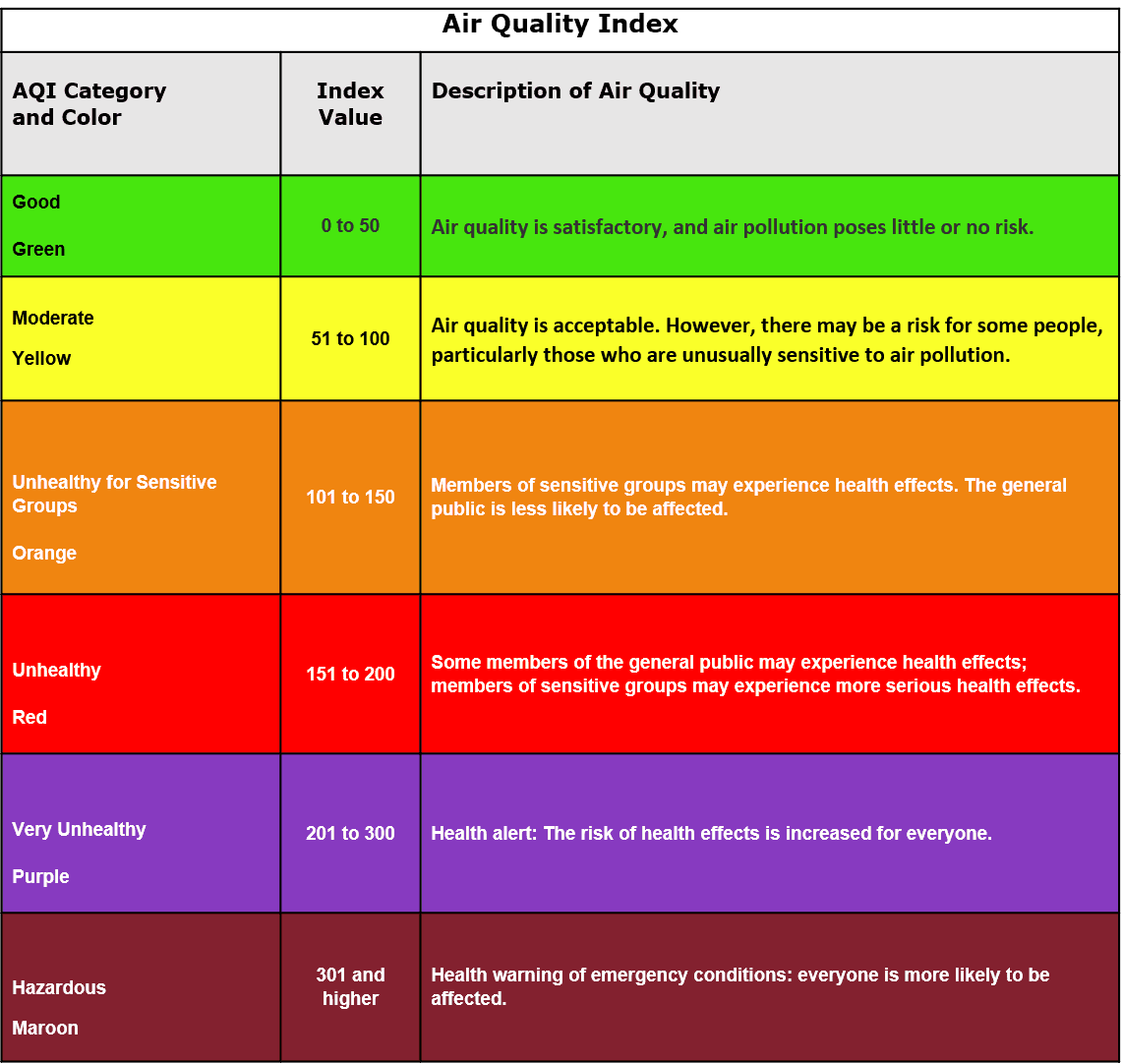
EPA verified palette
For color accessibility issues like these, and since the JustAir dashboard is very data-heavy, I would normally suggest using Cividis or Viridis color palettes. But we can’t use them here because the EPA color palette needs to stay the same for air quality reporting. So, we need to find accessible alternatives that still follow the EPA guidelines.
UX Analysis
After the accessibility testing, I wanted to be certain I understood all the issues within the dash. Automated tools can’t really capture contextual problems or the more nuanced difficulties users may run into.
I broke the user-facing monitor dashboard into three sections:
The pollutant row
The “compare monitors” tab
The graphs
This lets me understand how each section contributes to the overall user experience, identify where friction occurs, and see how well the interface supports different user tasks.


Pollutant Row


Compare Monitors Tab


Graphs
Pollutant Row Redesign
Pollutant Row
Old Design Findings


Pollutant Row


Header
Details Hidden by Default
Content Priority
Discoverability
Information Hierarchy
UX Flow
The “Details” tab is collapsed initially, hiding key information such as individual pollutant readings, the main AQI-driving pollutant, and related health impacts.
Since pollutant data is more important to users than raw monitor info, this default state reduces discoverability and usability.
Color Dependence and Accessibility Gaps
Inclusivity
Accessibility
Redundant Cues
Non-Color Indicators
Color-blind testing reveals heavy reliance on hue to convey pollutant severity and category.
Labels and icons should provide non-color indicators (e.g., text, icons, or shapes).
Missing Measurement Units
Scientific Accuracy
Units
Credibility
Consistency
Pollutant values are missing units such as µg/m³ or ppm, which are essential for context and scientific accuracy.
Unclear Section Title
Clarity
Content Design
I/A Naming
The section currently says “See Details” without specifying what details are shown.
Consider adding a clear title such as “Individual Pollutant Details” or “Pollutant Breakdown”.
Hidden Hourly Pollutant Trends
Data Viz
Findability
Time-Series
IA
Hourly pollutant data exists but isn’t directly visible within the pollutant tab.
Relocating this data to the Pollutant Tracking section would make temporal patterns easier to explore.
Inaccurate Health Impact Messaging
Trust/Credibility
Accuracy
Content–Data Alignment
The Health Impact bar visually looks fine but continues to show negative or severe warnings even when AQI values indicate good air quality.
Text and severity level should align with actual AQI risk categories.
Primary AQI Driver Not Clearly Identified
Information Architecture
Clarity
Labeling
Competitive Parity
The main pollutant driving the AQI is mentioned vaguely at the top as the “main concern” and bolded in readings, but not explicitly labeled.
Competing dashboards use a clearly marked “Primary AQI Driver” tag or highlighted card, improving clarity.
Scroll Sideways
Details Hidden by Default
Content Priority
Discoverability
Information Hierarchy
UX Flow
The “Details” tab is collapsed initially, hiding key information such as individual pollutant readings, the main AQI-driving pollutant, and related health impacts.
Since pollutant data is more important to users than raw monitor info, this default state reduces discoverability and usability.
Color Dependence and Accessibility Gaps
Inclusivity
Accessibility
Redundant Cues
Non-Color Indicators
Color-blind testing reveals heavy reliance on hue to convey pollutant severity and category.
Labels and icons should provide non-color indicators (e.g., text, icons, or shapes).
Color Dependence and Accessibility Gaps
Inclusivity
Accessibility
Redundant Cues
Non-Color Indicators
Color-blind testing reveals heavy reliance on hue to convey pollutant severity and category.
Labels and icons should provide non-color indicators (e.g., text, icons, or shapes).
Missing Measurement Units
Scientific Accuracy
Units
Credibility
Consistency
Pollutant values are missing units such as µg/m³ or ppm, which are essential for context and scientific accuracy.
Missing Measurement Units
Scientific Accuracy
Units
Credibility
Consistency
Pollutant values are missing units such as µg/m³ or ppm, which are essential for context and scientific accuracy.
Unclear Section Title
Clarity
Content Design
I/A Naming
The section currently says “See Details” without specifying what details are shown.
Consider adding a clear title such as “Individual Pollutant Details” or “Pollutant Breakdown”.
Unclear Section Title
Clarity
Content Design
I/A Naming
The section currently says “See Details” without specifying what details are shown.
Consider adding a clear title such as “Individual Pollutant Details” or “Pollutant Breakdown”.
Hidden Hourly Pollutant Trends
Data Viz
Findability
Time-Series
IA
Hourly pollutant data exists but isn’t directly visible within the pollutant tab.
Relocating this data to the Pollutant Tracking section would make temporal patterns easier to explore.
Hidden Hourly Pollutant Trends
Data Viz
Findability
Time-Series
IA
Hourly pollutant data exists but isn’t directly visible within the pollutant tab.
Relocating this data to the Pollutant Tracking section would make temporal patterns easier to explore.
Inaccurate Health Impact Messaging
Trust/Credibility
Accuracy
Content–Data Alignment
The Health Impact bar visually looks fine but continues to show negative or severe warnings even when AQI values indicate good air quality.
Text and severity level should align with actual AQI risk categories.
Inaccurate Health Impact Messaging
Trust/Credibility
Accuracy
Content–Data Alignment
The Health Impact bar visually looks fine but continues to show negative or severe warnings even when AQI values indicate good air quality.
Text and severity level should align with actual AQI risk categories.
Primary AQI Driver Not Clearly Identified
Information Architecture
Clarity
Labeling
Competitive Parity
The main pollutant driving the AQI is mentioned vaguely at the top as the “main concern” and bolded in readings, but not explicitly labeled.
Competing dashboards use a clearly marked “Primary AQI Driver” tag or highlighted card, improving clarity.
Details Hidden by Default
Content Priority
Discoverability
Information Hierarchy
UX Flow
The “Details” tab is collapsed initially, hiding key information such as individual pollutant readings, the main AQI-driving pollutant, and related health impacts.
Since pollutant data is more important to users than raw monitor info, this default state reduces discoverability and usability.
Color Dependence and Accessibility Gaps
Inclusivity
Accessibility
Redundant Cues
Non-Color Indicators
Color-blind testing reveals heavy reliance on hue to convey pollutant severity and category.
Labels and icons should provide non-color indicators (e.g., text, icons, or shapes).
Color Dependence and Accessibility Gaps
Inclusivity
Accessibility
Redundant Cues
Non-Color Indicators
Color-blind testing reveals heavy reliance on hue to convey pollutant severity and category.
Labels and icons should provide non-color indicators (e.g., text, icons, or shapes).
Missing Measurement Units
Scientific Accuracy
Units
Credibility
Consistency
Pollutant values are missing units such as µg/m³ or ppm, which are essential for context and scientific accuracy.
Missing Measurement Units
Scientific Accuracy
Units
Credibility
Consistency
Pollutant values are missing units such as µg/m³ or ppm, which are essential for context and scientific accuracy.
Unclear Section Title
Clarity
Content Design
I/A Naming
The section currently says “See Details” without specifying what details are shown.
Consider adding a clear title such as “Individual Pollutant Details” or “Pollutant Breakdown”.
Unclear Section Title
Clarity
Content Design
I/A Naming
The section currently says “See Details” without specifying what details are shown.
Consider adding a clear title such as “Individual Pollutant Details” or “Pollutant Breakdown”.
Hidden Hourly Pollutant Trends
Data Viz
Findability
Time-Series
IA
Hourly pollutant data exists but isn’t directly visible within the pollutant tab.
Relocating this data to the Pollutant Tracking section would make temporal patterns easier to explore.
Hidden Hourly Pollutant Trends
Data Viz
Findability
Time-Series
IA
Hourly pollutant data exists but isn’t directly visible within the pollutant tab.
Relocating this data to the Pollutant Tracking section would make temporal patterns easier to explore.
Inaccurate Health Impact Messaging
Trust/Credibility
Accuracy
Content–Data Alignment
The Health Impact bar visually looks fine but continues to show negative or severe warnings even when AQI values indicate good air quality.
Text and severity level should align with actual AQI risk categories.
Inaccurate Health Impact Messaging
Trust/Credibility
Accuracy
Content–Data Alignment
The Health Impact bar visually looks fine but continues to show negative or severe warnings even when AQI values indicate good air quality.
Text and severity level should align with actual AQI risk categories.
Primary AQI Driver Not Clearly Identified
Information Architecture
Clarity
Labeling
Competitive Parity
The main pollutant driving the AQI is mentioned vaguely at the top as the “main concern” and bolded in readings, but not explicitly labeled.
Competing dashboards use a clearly marked “Primary AQI Driver” tag or highlighted card, improving clarity.
The Redesign


Redesign of Pollutant Row
Clear Primary AQI Driver Placement
Clarity
Visual Hierarchy
Status Communication
Education
The main AQI-driving pollutant now sits at the top of the row, highlighted with clear status text and more space for a short description.
There’s also room for a “Learn More” button that can link to external resources for deeper explanations.
Redundant Visual Cues for Accessibility
Accessibility
Redundant Cues
Status Labeling
Every pollutant card now has both color indicators and text labels (like “Good,” “Moderate,” “Unhealthy”).
This provides redundant ways to understand status, so even users with color-vision deficiencies can easily interpret it.
Clear Primary AQI Driver Placement
Clarity
Visual Hierarchy
Status Communication
Education
The main AQI-driving pollutant now sits at the top of the row, highlighted with clear status text and more space for a short description.
There’s also room for a “Learn More” button that can link to external resources for deeper explanations.
Redundant Visual Cues for Accessibility
Accessibility
Redundant Cues
Status Labeling
Every pollutant card now has both color indicators and text labels (like “Good,” “Moderate,” “Unhealthy”).
This provides redundant ways to understand status, so even users with color-vision deficiencies can easily interpret it.


Redesign Primary AQI Driver Interaction
Redesign
Primary AQI Driver Interaction


Redesign Individual Pollutants Interaction
Redesign
Individual Pollutants Interaction
Expandable Hourly Graphs
Data Viz
Progressive Disclosure
Interactivity
Time-Series
Tapping a pollutant expands it into its own mini-chart, showing the hourly AQI trend for that specific pollutant.
This helps users quickly track how air quality changes throughout the day.
Measurement Units Added
Units
Scientific Accuracy
Consistency
Each pollutant value now includes the correct measurement unit (µg/m³ or ppm), giving readings more context and scientific clarity.
Clearer Labeling and Actions
Clarity
Affordance/Feedback
IA
Actionability
The expandable section now reads “Individual AQI Pollutants” instead of “See Details”, making it obvious what users will find inside.
I also added a selector box to show which element is active or selected, improving interaction feedback.
Scroll Sideways
Expandable Hourly Graphs
Data Viz
Progressive Disclosure
Interactivity
Time-Series
Tapping a pollutant expands it into its own mini-chart, showing the hourly AQI trend for that specific pollutant.
This helps users quickly track how air quality changes throughout the day.
Expandable Hourly Graphs
Data Viz
Progressive Disclosure
Interactivity
Time-Series
Tapping a pollutant expands it into its own mini-chart, showing the hourly AQI trend for that specific pollutant.
This helps users quickly track how air quality changes throughout the day.
Measurement Units Added
Units
Scientific Accuracy
Consistency
Each pollutant value now includes the correct measurement unit (µg/m³ or ppm), giving readings more context and scientific clarity.
Measurement Units Added
Units
Scientific Accuracy
Consistency
Each pollutant value now includes the correct measurement unit (µg/m³ or ppm), giving readings more context and scientific clarity.
Clearer Labeling and Actions
Clarity
Affordance/Feedback
IA
Actionability
The expandable section now reads “Individual AQI Pollutants” instead of “See Details”, making it obvious what users will find inside.
I also added a selector box to show which element is active or selected, improving interaction feedback.
Expandable Hourly Graphs
Data Viz
Progressive Disclosure
Interactivity
Time-Series
Tapping a pollutant expands it into its own mini-chart, showing the hourly AQI trend for that specific pollutant.
This helps users quickly track how air quality changes throughout the day.
Expandable Hourly Graphs
Data Viz
Progressive Disclosure
Interactivity
Time-Series
Tapping a pollutant expands it into its own mini-chart, showing the hourly AQI trend for that specific pollutant.
This helps users quickly track how air quality changes throughout the day.
Measurement Units Added
Units
Scientific Accuracy
Consistency
Each pollutant value now includes the correct measurement unit (µg/m³ or ppm), giving readings more context and scientific clarity.
Measurement Units Added
Units
Scientific Accuracy
Consistency
Each pollutant value now includes the correct measurement unit (µg/m³ or ppm), giving readings more context and scientific clarity.
Clearer Labeling and Actions
Clarity
Affordance/Feedback
IA
Actionability
The expandable section now reads “Individual AQI Pollutants” instead of “See Details”, making it obvious what users will find inside.
I also added a selector box to show which element is active or selected, improving interaction feedback.
New Addition
Dynamic Health Messaging
Accuracy
Content–Data Alignment
Contextual Messaging
Risk Communication
The health message below each monitor now updates based on the AQI level, so users see context-specific guidance instead of the same generic warning.
For example, safe levels show reassuring messages, while higher levels provide relevant health cautions.


Redesign "Safe" Health Messaging
Redesign "Safe"
Health Messaging


Redesign "Hazardous" Health Messaging
Redesign "Hazardous"
Health Messaging
Dynamic Health Messaging
Accuracy
Content–Data Alignment
Contextual Messaging
Risk Communication
The health message below each monitor now updates based on the AQI level, so users see context-specific guidance instead of the same generic warning.
For example, safe levels show reassuring messages, while higher levels provide relevant health cautions.


Redesign "Safe" Health Messaging


Redesign "Hazardous" Health Messaging
Compare Monitors Redesign
Compare Monitors
Old Design Findings


Compare Monitors Tab


Expanded Compare Monitors


Monitor Search Results
Visually crowded layout
The tab feels overloaded, too many controls, badges, and labels clustered together with minimal spacing and contrast, so nothing stands out.
Low-contrast labels
Several label colors don’t meet contrast guidelines, making AQI numbers hard to read against their backgrounds.
Dropdown label on the border
The AQI pollutant dropdown uses a label that sits on the bounding box (floating label style) in a way that clips/overlaps, reducing clarity and accessibility.
Repetitive “AQI” labeling
“AQI” appears repeatedly in line items and headers, creating label noise without adding meaning.
Hue-only series differentiation
Monitor series are distinguished only by color, which fails color-blind scenarios and hurts multi-series reading.
Hard-to-see AQI colors in search suggestions
The chips/suggestions rely on subtle hue shifts; in many cases, the AQI value and state aren’t legible at a glance.
Scroll Sideways
Visually crowded layout
The tab feels overloaded, too many controls, badges, and labels clustered together with minimal spacing and contrast, so nothing stands out.
Visually crowded layout
The tab feels overloaded, too many controls, badges, and labels clustered together with minimal spacing and contrast, so nothing stands out.
Low-contrast labels
Several label colors don’t meet contrast guidelines, making AQI numbers hard to read against their backgrounds.
Low-contrast labels
Several label colors don’t meet contrast guidelines, making AQI numbers hard to read against their backgrounds.
Hue-only series differentiation
Monitor series are distinguished only by color, which fails color-blind scenarios and hurts multi-series reading.
Hue-only series differentiation
Monitor series are distinguished only by color, which fails color-blind scenarios and hurts multi-series reading.
Hard-to-see AQI colors in search suggestions
The chips/suggestions rely on subtle hue shifts; in many cases, the AQI value and state aren’t legible at a glance.
Hard-to-see AQI colors in search suggestions
The chips/suggestions rely on subtle hue shifts; in many cases, the AQI value and state aren’t legible at a glance.
Dropdown label on the border
The AQI pollutant dropdown uses a label that sits on the bounding box (floating label style) in a way that clips/overlaps, reducing clarity and accessibility.
Dropdown label on the border
The AQI pollutant dropdown uses a label that sits on the bounding box (floating label style) in a way that clips/overlaps, reducing clarity and accessibility.
Repetitive “AQI” labeling
“AQI” appears repeatedly in line items and headers, creating label noise without adding meaning.
Repetitive “AQI” labeling
“AQI” appears repeatedly in line items and headers, creating label noise without adding meaning.
Visually crowded layout
The tab feels overloaded, too many controls, badges, and labels clustered together with minimal spacing and contrast, so nothing stands out.
Visually crowded layout
The tab feels overloaded, too many controls, badges, and labels clustered together with minimal spacing and contrast, so nothing stands out.
Low-contrast labels
Several label colors don’t meet contrast guidelines, making AQI numbers hard to read against their backgrounds.
Low-contrast labels
Several label colors don’t meet contrast guidelines, making AQI numbers hard to read against their backgrounds.
Dropdown label on the border
The AQI pollutant dropdown uses a label that sits on the bounding box (floating label style) in a way that clips/overlaps, reducing clarity and accessibility.
Dropdown label on the border
The AQI pollutant dropdown uses a label that sits on the bounding box (floating label style) in a way that clips/overlaps, reducing clarity and accessibility.
Repetitive “AQI” labeling
“AQI” appears repeatedly in line items and headers, creating label noise without adding meaning.
Repetitive “AQI” labeling
“AQI” appears repeatedly in line items and headers, creating label noise without adding meaning.
Hue-only series differentiation
Monitor series are distinguished only by color, which fails color-blind scenarios and hurts multi-series reading.
Hue-only series differentiation
Monitor series are distinguished only by color, which fails color-blind scenarios and hurts multi-series reading.
Hard-to-see AQI colors in search suggestions
The chips/suggestions rely on subtle hue shifts; in many cases, the AQI value and state aren’t legible at a glance.
Hard-to-see AQI colors in search suggestions
The chips/suggestions rely on subtle hue shifts; in many cases, the AQI value and state aren’t legible at a glance.
New Design


Redesign Compare Monitors Tab


Updated Color Palette


Updated Search Results
Monitor search options
Redesigned the search results so AQI numbers have high contrast and remain readable against the input background.
Removed the repeated “AQI” text and added a concise secondary label that states the air-quality status (e.g., “Good,” “Moderate”).
Monitor search options
Redesigned the search results so AQI numbers have high contrast and remain readable against the input background.
Removed the repeated “AQI” text and added a concise secondary label that states the air-quality status (e.g., “Good,” “Moderate”).
Monitor tags & toolbar layout
Increased spacing and improved contrast so the tags do not feel cramped next to the “Select 2 Nearby” and “Clear Selected” buttons.
Updated the tag design to improve contrast so the aqi number is clearly visible
Monitor tags & toolbar layout
Increased spacing and improved contrast so the tags do not feel cramped next to the “Select 2 Nearby” and “Clear Selected” buttons.
Updated the tag design to improve contrast so the aqi number is clearly visible
Monitor search options
Redesigned the search results so AQI numbers have high contrast and remain readable against the input background.
Removed the repeated “AQI” text and added a concise secondary label that states the air-quality status (e.g., “Good,” “Moderate”).
Monitor search options
Redesigned the search results so AQI numbers have high contrast and remain readable against the input background.
Removed the repeated “AQI” text and added a concise secondary label that states the air-quality status (e.g., “Good,” “Moderate”).
Monitor tags & toolbar layout
Increased spacing and improved contrast so the tags do not feel cramped next to the “Select 2 Nearby” and “Clear Selected” buttons.
Updated the tag design to improve contrast so the aqi number is clearly visible
Monitor tags & toolbar layout
Increased spacing and improved contrast so the tags do not feel cramped next to the “Select 2 Nearby” and “Clear Selected” buttons.
Updated the tag design to improve contrast so the aqi number is clearly visible
Expanded view for selected monitors
Removed redundant “AQI” labels and strengthened the contrast of the numbers so the key values stand out.
Added a secondary status label for each monitor so users can confirm meaning at a glance without relying only on color.
Added a “Current ” label for the primary monitor
Individual pollutants inside the expanded view
Replaced the tight table layout with roomier dialog-style cards to improve readability for values, units, and labels.
Added explicit status labels to support users with color-vision differences, so severity is clear even without color.
Introduced a circular badge to highlight the primary pollutant, which makes the main driver immediately visible. (We do this in the previous design too.)
Updated Expanded Compare Monitors


Expanded view for selected monitors
Removed redundant “AQI” labels and strengthened the contrast of the numbers so the key values stand out.
Added a secondary status label for each monitor so users can confirm meaning at a glance without relying only on color.
Added a “Current ” label for the primary monitor
Individual pollutants inside the expanded view
Replaced the tight table layout with roomier dialog-style cards to improve readability for values, units, and labels.
Added explicit status labels to support users with color-vision differences, so severity is clear even without color.
Introduced a circular badge to highlight the primary pollutant, which makes the main driver immediately visible. (We do this in the previous design too.)


Updated Expanded Compare Monitors
Graphs
Improving Graph Accessibility and Consistency
We currently use two types of charts across the JustAir platform
the default view and
the compare charts.
Both share similar usability and accessibility issues:


Default View


Compare Monitors View
Visual Overload
The charts display too much information at once . With dense X and Y-axis labels, low-contrast label colors, and excessive grid lines that add visual clutter, making it harder to focus on key insights.
Inconsistent Chart Styles
Two different chart styles are used in different sections, which breaks visual consistency. Unifying all graphs across the platform creates a more predictable user experience and improves accessibility.
Keyboard Navigation Support
The graphs already include basic keyboard navigation, which is a strong accessibility feature. My goal is to build on this foundation to make interaction smoother and more intuitive.
Color-Accessibility Gaps
Color-blindness testing reveals that the chart legends rely solely on color to distinguish data series. Without text, pattern, or shape differentiation, users with color-vision deficiencies cannot tell the lines apart.
Cognitive Simplicity for Quick Viewing
For casual or at-a-glance users, displaying a plot point for every hour feels overwhelming and difficult to interpret. Reducing visual density or grouping data improves readability and comprehension.
Scroll Sideways
Visual Overload
The charts display too much information at once . With dense X and Y-axis labels, low-contrast label colors, and excessive grid lines that add visual clutter, making it harder to focus on key insights.
Visual Overload
The charts display too much information at once . With dense X and Y-axis labels, low-contrast label colors, and excessive grid lines that add visual clutter, making it harder to focus on key insights.
Inconsistent Chart Styles
Two different chart styles are used in different sections, which breaks visual consistency. Unifying all graphs across the platform creates a more predictable user experience and improves accessibility.
Inconsistent Chart Styles
Two different chart styles are used in different sections, which breaks visual consistency. Unifying all graphs across the platform creates a more predictable user experience and improves accessibility.
Keyboard Navigation Support
The graphs already include basic keyboard navigation, which is a strong accessibility feature. My goal is to build on this foundation to make interaction smoother and more intuitive.
Keyboard Navigation Support
The graphs already include basic keyboard navigation, which is a strong accessibility feature. My goal is to build on this foundation to make interaction smoother and more intuitive.
Color-Accessibility Gaps
Color-blindness testing reveals that the chart legends rely solely on color to distinguish data series. Without text, pattern, or shape differentiation, users with color-vision deficiencies cannot tell the lines apart.
Color-Accessibility Gaps
Color-blindness testing reveals that the chart legends rely solely on color to distinguish data series. Without text, pattern, or shape differentiation, users with color-vision deficiencies cannot tell the lines apart.
Cognitive Simplicity for Quick Viewing
For casual or at-a-glance users, displaying a plot point for every hour feels overwhelming and difficult to interpret. Reducing visual density or grouping data improves readability and comprehension.
Cognitive Simplicity for Quick Viewing
For casual or at-a-glance users, displaying a plot point for every hour feels overwhelming and difficult to interpret. Reducing visual density or grouping data improves readability and comprehension.
Visual Overload
The charts display too much information at once . With dense X and Y-axis labels, low-contrast label colors, and excessive grid lines that add visual clutter, making it harder to focus on key insights.
Visual Overload
The charts display too much information at once . With dense X and Y-axis labels, low-contrast label colors, and excessive grid lines that add visual clutter, making it harder to focus on key insights.
Inconsistent Chart Styles
Two different chart styles are used in different sections, which breaks visual consistency. Unifying all graphs across the platform creates a more predictable user experience and improves accessibility.
Inconsistent Chart Styles
Two different chart styles are used in different sections, which breaks visual consistency. Unifying all graphs across the platform creates a more predictable user experience and improves accessibility.
Keyboard Navigation Support
The graphs already include basic keyboard navigation, which is a strong accessibility feature. My goal is to build on this foundation to make interaction smoother and more intuitive.
Keyboard Navigation Support
The graphs already include basic keyboard navigation, which is a strong accessibility feature. My goal is to build on this foundation to make interaction smoother and more intuitive.
Color-Accessibility Gaps
Color-blindness testing reveals that the chart legends rely solely on color to distinguish data series. Without text, pattern, or shape differentiation, users with color-vision deficiencies cannot tell the lines apart.
Color-Accessibility Gaps
Color-blindness testing reveals that the chart legends rely solely on color to distinguish data series. Without text, pattern, or shape differentiation, users with color-vision deficiencies cannot tell the lines apart.
Cognitive Simplicity for Quick Viewing
For casual or at-a-glance users, displaying a plot point for every hour feels overwhelming and difficult to interpret. Reducing visual density or grouping data improves readability and comprehension.
Cognitive Simplicity for Quick Viewing
For casual or at-a-glance users, displaying a plot point for every hour feels overwhelming and difficult to interpret. Reducing visual density or grouping data improves readability and comprehension.
The Redesign


Redesign Default View


Redesign Compare Monitors View


Redesign Default Hover/Click View


Redesign Compare Monitors Hover/Click View
Redesign
Compare Monitors Hover/Click View
Visual Consistency Across Graphs
To begin addressing the issues, I focused on making all charts visually consistent.
I adopted the colored AQI blocks from the Compare Charts and applied them to the Default Chart View as well. This creates a unified design language and helps users instantly recognize AQI levels across the platform.
Improving Accessibility for Color-Blind Users
Color-blindness testing revealed that relying solely on color in the Compare Monitors chart made it difficult for some users to distinguish between plotlines.
To fix this, I added non-color-based differentiation using line styles.
This ensures that each monitor’s data is visually distinct even for users with red-green or blue-yellow color vision deficiencies.
I also suggested icon-based differentiation (e.g., squares, triangles, circles). But if that's not possible, line patterns are better for continuous data and easier to maintain.
Simplified and Responsive Chart States
The charts now include distinct interaction states:
Default State: A clean, simplified view for quick scanning.
Hover State: Highlights relevant data points and grid lines on hover for contextual clarity.
Clicked State: Allows for Keyboard navigation and Displays detailed values and interactive labels.
This tiered interaction reduces noise while still offering detail when needed.
Reducing Visual Clutter
I streamlined the axes and grid system to make the data easier to read:
X-axis labels now appear every 5 hours instead of every hour.
Y-axis labels appear only at standard AQI thresholds (50, 100, 150, etc.).
Grid lines are removed from the default view and only appear on hover or click.
Each plotline is labeled directly on the line itself, so users don’t have to look back and forth between the chart and the legend.
These changes significantly improve readability and reduce visual clutter.
Scroll Sideways
Visual Consistency Across Graphs
To begin addressing the issues, I focused on making all charts visually consistent.
I adopted the colored AQI blocks from the Compare Charts and applied them to the Default Chart View as well. This creates a unified design language and helps users instantly recognize AQI levels across the platform.
Improving Accessibility for Color-Blind Users
Color-blindness testing revealed that relying solely on color in the Compare Monitors chart made it difficult for some users to distinguish between plotlines.
To fix this, I added non-color-based differentiation using line styles.
This ensures that each monitor’s data is visually distinct even for users with red-green or blue-yellow color vision deficiencies.
I also suggested icon-based differentiation (e.g., squares, triangles, circles). But if that's not possible, line patterns are better for continuous data and easier to maintain.
Simplified and Responsive Chart States
The charts now include distinct interaction states:
Default State: A clean, simplified view for quick scanning.
Hover State: Highlights relevant data points and grid lines on hover for contextual clarity.
Clicked State: Allows for Keyboard navigation and Displays detailed values and interactive labels.
This tiered interaction reduces noise while still offering detail when needed.
Reducing Visual Clutter
I streamlined the axes and grid system to make the data easier to read:
X-axis labels now appear every 5 hours instead of every hour.
Y-axis labels appear only at standard AQI thresholds (50, 100, 150, etc.).
Grid lines are removed from the default view and only appear on hover or click.
Each plotline is labeled directly on the line itself, so users don’t have to look back and forth between the chart and the legend.
These changes significantly improve readability and reduce visual clutter.


Old Graph Interaction


Redesign Graph Interaction
Refining Legend Interactions
The Compare Monitors legend interaction is now intuitive and aligned with standard data-visualization behavior
Previously, clicking a label excluded that series and showed the rest, which felt reversed.
Now, clicking a legend label isolates that series, hiding the others.
Users can click additional labels to re-include them.
A “Reset View” button restores all series and returns the chart to its original zoom or position.
This aligns with how most analytics tools like Plotly, Chart.js, and Google Charts handle legend toggling.
Visual Consistency Across Graphs
To begin addressing the issues, I focused on making all charts visually consistent.
I adopted the colored AQI blocks from the Compare Charts and applied them to the Default Chart View as well. This creates a unified design language and helps users instantly recognize AQI levels across the platform.
Simplified and Responsive Chart States
The charts now include distinct interaction states:
Default State: A clean, simplified view for quick scanning.
Hover State: Highlights relevant data points and grid lines on hover for contextual clarity.
Clicked State: Allows for Keyboard navigation and Displays detailed values and interactive labels.
This tiered interaction reduces noise while still offering detail when needed.
Reducing Visual Clutter
I streamlined the axes and grid system to make the data easier to read:
X-axis labels now appear every 5 hours instead of every hour.
Y-axis labels appear only at standard AQI thresholds (50, 100, 150, etc.).
Grid lines are removed from the default view and only appear on hover or click.
Each plotline is labeled directly on the line itself, so users don’t have to look back and forth between the chart and the legend.
These changes significantly improve readability and reduce visual clutter.
Improving Accessibility for Color-Blind Users
Color-blindness testing revealed that relying solely on color in the Compare Monitors chart made it difficult for some users to distinguish between plotlines.
To fix this, I added non-color-based differentiation using line styles.
This ensures that each monitor’s data is visually distinct even for users with red-green or blue-yellow color vision deficiencies.
I also suggested icon-based differentiation (e.g., squares, triangles, circles). But if that's not possible, line patterns are better for continuous data and easier to maintain.
5. Refining Legend Interactions
The Compare Monitors legend interaction is now intuitive and aligned with standard data-visualization behavior
Previously, clicking a label excluded that series and showed the rest, which felt reversed.
Now, clicking a legend label isolates that series, hiding the others.
Users can click additional labels to re-include them.
A “Reset View” button restores all series and returns the chart to its original zoom or position.
This aligns with how most analytics tools like Plotly, Chart.js, and Google Charts handle legend toggling.
Wind Information Panel
I wanted to find a balance between presenting enough wind information and keeping it easy to understand at a glance.
Wind roses were a required element, but showing a full traditional wind rose upfront can feel overwhelming or confusing for many users.
The goal was to offer clarity for people who are new to this kind of data while still providing the depth that more experienced users expect.


Wind Information Panel


Expanded Wind Information Panel
The dashboard shows wind speed and direction upfront, along with a brief contextual message to help users quickly understand current conditions. Additional details about wind behavior appear beneath that, and a button gives users the option to open the full wind rose if they want deeper insights. This structure supports both quick scanning and more advanced exploration, helping users understand real wind patterns that aren’t immediately obvious.
I believe this layout helps users gradually learn how to interpret wind roses by connecting them to the surrounding context. It encourages interactive learning, allowing users to explore and compare patterns to better understand real-world wind behavior. Over time, users can develop the confidence to read wind roses on their own, even without relying on the supplemental explanations.
Below are the different types of wind dialog cases I considered, including edge cases where multiple winds blow with similar strength. The goal here is to make sure the panel covers typical conditions and those less obvious, balanced cases.”


Global UI Improvements
I updated the dashboard’s primary blue to # 0055AA to preserve the JustAir look while passing contrast on light and white surfaces. I wanted to keep the brand hue, so I searched for a nearby blue that meets WCAG AA; this hit the balance between familiarity and legibility.
From there, I rebuilt the design system.


